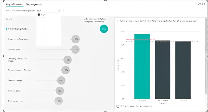
Image source – https://www.sqlshack.com/
Struggling to Quickly Pinpoint the Key Drivers Behind Performance Issues? Power BI’s Key Influencer Has You Covered
Business leaders often ask questions like “Why did sales drop last month?” or “What’s causing higher customer churn lately?”. However, finding the root factors driving underperformance can be tedious parsing giant data sets manually.
Power BI’s Key Influencer visual makes diagnostic discovery effortless. Let’s explore how it spotlights root causes through intuitive interactive visualizations.
Underperformance happens for many reasons – economic conditions worsen affecting buyer budgets, new competitors enter stealing market share, and ad campaigns lose resonance with audience tastes changing.
With so many potential contributors, narrowing down the vital few variables catalyzing emerging issues feels daunting.
Power BI’s Key Influencer visual leverages sophisticated algorithms to digest all probable drivers of business metrics from your data, then visually spotlights the subset having statistically significant relationships with the outcome trending unfavorably.
The clarity instantly focuses further investigation or corrective actions on true root causes rather than speculation or intuition potentially leading teams astray.
Just a few clicks can help transform gut instincts into data-driven decisive insights.
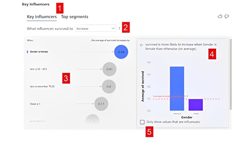
Image source – https://www.acuitytraining.co.uk/
1) Connect Datasets and Identify Target Metric
Of course, even the most advanced analytics can’t create insights from thin air.
Relevant historical data covering both business performance trends along potential influencing factors needs consolidation first.
For a sales leadership team noticing revenues trending down, pertinent datasets would cover:
- Revenue amounts, totals, and conversions over the past 6+ months
- Leading rep and customer account details associated with deals
- Campaigns, promotions, and pricing history aligned to respective deals
- Qualitative notes on market, competitor, or macroeconomic observations
Power BI develops these datasets together through its unified data model connecting disparate sources into common views.
The key outcome metric driving action is of course the worrisome revenue decline in this case. But all other fields represent inputs analyzed against the target.
Data wrangling and shaping steps further optimize dataset compatibility with Key Influencers before visual analysis:
- Handle data completeness issues and abnormalities that distort trends
- Identify field data types – numeric metrics vs. descriptors like customer industry
- Set date tables aligning timeline measures consistently
- Map field hierarchies like sales territories rolling up into regions
- Connect data relationships across entities like campaigns to deals
Once aligned to a clean data model, drag the Key Influencer visual onto the report canvas and select the target metric of concern – declining sales revenue – initiating automated driver analysis behind the scenes.
2) Interpret Key Influencer Visual Cues and Patterns
Within seconds, Power BI scans potentially thousands of data points across dozens of fields, narrowing down the specific elements demonstrating the strongest statistical correlation and likely causal links to the underperforming metric.
Key Influencer renders the output as an interactive visualization spotlighting maximal root cause clarity.
The analysis distills the results into three critical sections:
Key Drivers Tile Chart
The heart of the visual calls immediate attention to major factors driving target outcomes, with horizontal bar lengths proportional to significance.
For declining sales, major dips across certain regions, customer segments not responding to the latest marketing offers, and expanded pricing discounts prove influential. Segment variances become crystal clear.
Historical Trend Chart
Selecting any bar instantly graphs the target metric over time as that specific driver fluctuates, illustrating the alignment between movements.
Spiking discounts mid-summer correspond neatly with revenues dropping shortly after for example. Quick comparisons to overall trends also discern impact severity.
Drivers Ribbon Chart
The bottom ribbon repeats driver importance ordering from the top tile chart but applies color saturation representative of how each data element skewed positive vs negative over the target metric’s time course.
Deep red shades quickly call out concerning directions of impact. Through both views combined, focusing further analyses and corrective actions becomes straightforward for only the most vital few elements.
Best of all, modifying the date filter range or specific target metric instantly updates analyses, allowing fluid investigation.
If sales decline localized heavily in Q3, quickly re-run scoped only to July through September and validate initial findings still hold underpinning the worrisome trend.
3) Craft Corrective Actions Tuned to Causal Drivers
Armed with data-driven clarity on real catalysts behind undesirable performance swings, addressing root causes through focused business response plans gets far easier, even if still requires difficult decisions.
Revisiting concerning revenue downtrends amid increased pricing discounts, leadership might elect to:
Realign Sales Incentives
Are expanded discounts the result of reps seeking easier sales despite profit impacts?
Tightening quota policies and sharpening incentive structures to better reward profitability lift could help course correct behaviors.
Reshape Price Bundle Offers
Are wider discounts attempted short-term bandages showing cracks in uncompetitive core pricing models? Research optimal price bundling and premium features warranting value. Open margins allow strategic flexibility long-term.
Double Down on High Value-Retention Tactics
If excessive discounts fruitlessly chase fickle transactional customers, perhaps redirect the budget toward VIP high-lifetime-value patrons less sensitive to temporary promotions. Key Influencer visuals help segment the best audience focus areas.
Launch Brand Messaging Campaigns
Does market perception misalign with reality on pricing dimensions? Proactively educate both prospects and existing accounts reinforcing premium value against competitors.
The ability to precisely hone in on action areas yields better resource efficiency and tightens strategy relevancy to address current dynamics missed by general approaches.
Combining insights across all elements – sales, marketing, analytics, and finance – sustains decisions through shared data truths.
4) Include Important Influencers in Frequent Reporting Cycles
Rather than just using Key Influencer occasionally for ad hoc analyses, consider building the visual into regular reporting deliverables, providing ongoing visibility into emerging performance drivers.
Leadership Team Reporting:
Modify executive dashboards to prominently feature Key Influencer analyses on top metrics like customer satisfaction, user engagement, and service case resolution times. Configure the visuals to process updated datasets as scheduled refreshes occur automatically.
Providing easy insights into what elements currently seem influential can focus discussions during periodic business reviews.
Furthermore, tracking movement quarter over quarter in underlying drivers enhances environmental scanning sensitivities for leaders.
Management Performance Reporting:
Individual teams own specific performance outcomes at more granular levels, like support case backlogs, account retention risks, or advertising click-through rates.
Embed Key Influencer visuals into group reports profiling their particular metrics, still powered through centralized data models.
This allows managers to continually monitor what inputs under their influence appear strongly correlated and likely causal to the ups and downs observed.
In turn, tailored action plans improve responding to dynamics particular to that department vs. company-wide trends.
Broader Knowledge Sharing:
Share reports containing Key Influencer visuals through Power BI’s collaboration capabilities for wider visibility beyond just core leadership roles.
Make interpreted findings accessible for peers companywide to absorb and align their local actions accordingly.
Enabling organic discoveries through openly available analysis views helps scale coordinated responses faster to address performance priorities as organizations grow more complex.
5) Export Data to Drive External Analysis
Although Power BI Key Influencer provides significant automated insights directly through visual interactivity, analysts may want to connect findings to additional statistical capabilities for ancillary investigation.
Exporting the core data components powering the visualization unlocks further possibilities:
Export All Source Data
Provide a full data extract to data science teams for running deeper multivariate regression models, simulations, and scenario forecasting using Python, R, and other platforms.
The raw dataset nourishes more advanced algorithms and techniques externally.
Export Key Drivers Details
Export only the narrowed list of key drivers influencing a given metric to feed summary presentations, dashboards, and reports maintained outside Power BI’s ecosystem.
Keeping lightweight extracts distilled to just major elements creates reporting versatility not having to fully reproduce analyses elsewhere.
Use Exports to Centralize Action Planning
Load key driver data into master planning systems enabling links between identified priority areas and execution tracking artifacts like projects, tasks, and system tickets.
This connects data-driven strategic priorities into operational activity flows companywide.
Feed Insights into Predictive Models
If clear seasonal or cyclical patterns emerge in key drivers, export time-series data to AutoML forecasting tools anticipating similar future fluctuations.
Proactively predict macro undercurrent impacts before surfacing in actual metrics.
Unlocking analytic data from Power BI visuals into external tools sustains a discovery-to-deployment flywheel delivering greater business value from unified insights.
6) Leverage a 360 View Correlating ALL Metrics
While focusing Key Influencers on one KPI at a time yields specific insights relative to that metric, are there any hidden connections across wider performance indicators? Unifying multiple lenses brings a holistic perspective:
Connect Multiple Departments
Blend datasets across sales, marketing, service, and operations and enable relationship analyses between their metrics like lead quality affecting conversion cycles affecting customer satisfaction affecting retention affecting profitability.
Identify Leading vs. Lagging Indicators
Spot early indicator metrics that consistently change ahead of lagging ones – web searches foreshadow sales pipeline volume, and staffing capacity signals case resolution times.
Help teams predict downstream impacts by responding earlier to real-time leading signals.
See Shared Macro Trends
If multiple metrics plunge together when fuel prices rise or currency shifts occur, broader correlated systemic contexts become clearer.
Isolate macro-environmental factors externally influencing business metrics broadly.
Trace Impact Cascades
When contact center staffing drops and in turn resolution times rise customer satisfaction drops and platform usage then declines, visualize the sequential effect chain.
Step through momentum consequences prioritizing actions on amplifying root causes.
Connecting lenses across data assets brings multidimensional perspectives resolving blurred boundaries between teams, causes, and effects. Explore interface insights with Key influencers!
7) Apply Key Influencer beyond Numerical Business Data
While the Key Influencer visual shines through quantitatively analyzing metric time series, creative applications to qualitative data open intriguing new possibilities:
Customer Sentiment Analysis
Ingest unstructured feedback data like segmented NPS responses, call center transcriptions, and churn reasons.
Connect to employee engagement or revenue metrics over the same period. Does criticism of certain offerings correlate to declining renewal rates?
Do branches with more positive cultures see less turnover impacting client continuity?
Text analytic capabilities help transform qualitative signals into quantitative variables for relationship modeling, exponentially expanding insights from existing data assets.
Process Performance Analysis
Incorporate process metrics like quality audit pass rates, compliance checklists, and operational risk scoring into Key Influencer models.
Connect to downstream success indicators like projects delivered on time/budget and plant safety incident rates.
Does process integrity trace through to realized performance outputs? Leveraging subjective operational health factors proves possible.
Digital Analytics Analysis
Blend web visitor behavioral data like page visit durations, navigation pathways, and content downloads with conversion or revenue metrics.
Do certain UX flows or site content assets consume correlations that outshine others affecting business outcomes?
Multidimensional analytics enable optimizations leveraging the complete experience data picture.
Macroeconomic Indicator Analysis
Ingest publically available indicator data feeds around employment rates, fuel costs, interest rate shifts, and weather events in relevant regions.
Reveal hidden covariates affecting sales or operations not captured in internal systems.
Isolating externalities provides context to organizational performance beyond existing business data while enhancing environmental scanning.
The ability to incorporate qualitative indicators as quantified inputs for relationship modeling with
Key Influencer vastly expands the realm of possibility applications, constrained only by the breadth of data made available. External data connector platforms enable even unstructured data leverage.
8) Scale Organizational Learning through Knowledge Transfer
To fully proliferate Benefits from invested efforts enabling data-driven decisions, focus attention on spreading knowledge transfer:
Train Analysts Proficiently
Develop boot camps and modular content guiding analysts through Key Influencer fundamentals:
Required data formats, interpretation of visualization cues, and exporting options.
Cover both tech specifics like DAX calculations for derived tables as well as framing communications of insights for business leaders prioritizing trust and clarity.
Cultivate Data-Driven Cultures
Promote perspective shifts through all-hands messaging and leadership emphasis on continuous learning and evidence-based mindsets.
Celebrate wins uncovered through data together and reinforce stories publicly. Shift language praising opinions equally as facts.
Automate Institutionalized Learning Triggers
Configure alerts or rules prompting automated analysis any time certain threshold breaches occur on key metrics, feeding insights to relevant parties immediately versus needing manual requests.
Cultivate curiosity by investigating contributing factors as routine through technology triggers.
Make High-Quality Discovery Fixtures
Curate reusable templates, customized visuals, and easy-to-follow demonstration narratives to demystify the process of navigating from issue observation to actionable cause-effect insights quickly.
Lower barriers to making decisions confidently backed by data.
Widespread user adoption and embedding practices sustain ROI gains over individually generated analyses.
Create leverage points and feedback loops fostering growth mindsets powered through modern data analytics.
What key questions around performance trends would you want to investigate in your roles? Please share additional use cases that come to mind in the comments below!


